Exos Coaching Session App Bookings
Since the launch of the Exos Fit app, scheduling coaching sessions was handled with the aid of a third-party integration. However, collaboration with this vendor led to security vulnerabilities and at the end of 2022 a project was launched to switch third-party scheduling partners. The project to adopt a new partner also focused on building a more custom and enhanced scheduling experience and allowing members to schedule in-person coaching sessions, which had been limited to only virtual sessions. Finally, the project also included the back-end experience for coaches and nutritionists who needed to use an internal platform to enter their session availability.
Timeline
PROJECT SNAPSHOT
This project spanned about 3-4 months.
My Role
I was the sole designer on the project and collaborated closely with the product manager, engineers and data scientist. I was responsible for final designs of the member-facing product and internal platform.
Results
The initial MVP of this redesign has not been finalized. However, the initial goal was ‘to do no harm’ and maintain the existing number of online sessions booked, while members also booked in-person sessions. Secondary KPIs were to increase the number of online sessions booked, particularly for follow-up sessions.
DISCOVERY & DEFINITION
UNDERSTANDING THE CURRENT EXPERIENCE
The project began by exploring the existing coaching session experience. I examined the current app flows and took an inventory of existing features. I conducted interviews with coaches/nutritionists/members of coaching operations to better understand their needs and practices. Finally, I did a brief audit of competitive/comparative booking experiences. My discovery led to key questions that would later shape my design phase.
What, if any, data will we collect from users?
In interviews with coaches and nutritionists it was clear that preparing for member sessions was challenging. Because of their large load most coaches and nutritionists had little time to prepare before meeting with a member. Nutritionists also didn’t have access to Coach Hub, the member database, and thus didn’t have much background information about a member before their session.
I began exploring the inclusion of questions in the booking flow to offer coaches and nutritionists more context. In my audit of different products I looked at how user data was collected and the types of questions asked.
How will in-person locations be displayed?
As this project included the addition of in-person bookings, this meant that a new affordance of scheduling sessions at a specific location would need to be addressed. Through my discovery process I learned that coaches may be present at more than one site. Through team discussions it was agreed to associate a coach with only one location in this MVP to decrease complexity and engineering effort. Questions around more specific location information, like specific rooms or floors, was also discussed but left out of the MVP for simplicity as well.
How can coaching sessions in the internal database be better displayed? How can coaches prompt a session within the internal database?
At the project start coaching sessions were displayed in Coach Hub, but only minimally. A coach could only see if a member had an upcoming session and the date. Nutritionists didn’t have any access to Coach Hub and nutrition sessions were not listed in the database. I was curious if we could display the type of coaching sessions, live or in-person, to give coaches more context. Finally, coaches also needed an easy way to prompt users to book a session, particularly a follow-up. Later, the affordance for coaches to send members a chat message to book a session was included in designs.
DESIGN
ENTERING THE BOOKING FLOW
I began wireframing by focusing on how members enter the session booking flow on the app’s Coaching landing page. I designed various information architecture models that were reviewed with the PM, engineers and data scientist.
Option 1: Side-by-side ‘chat’ and ‘schedule’ CTAs
This model places hierarchy around the available actions a member can take with their coach. However, a con with this approach is that not all members have access to a nutritionist through their employer. For these members this page would look very empty if the ‘Additional services’ section was not displayed.

Option 2: Stacked CTA cards
Simplicity and minimal effort is central to this approach. This model better adapts to those members who do not have a nutritionist. Finally, the large CTA cards offer an initial state that offers delight to persuade members to book their first session as well as a secondary state to offer valuable metadata to make the next booking.

Option 3: Tabs

By using tabs there is more screen real estate for ‘chat’ and ‘services’ content. A significant pro for this approach is that members can immediately land on coach chat without having to tap on a CTA. However, this also means sessions content would not be displayed upon default and could be missed/ignored by the user. The separate tabs though do offer a better layout to scale for future services in the future.
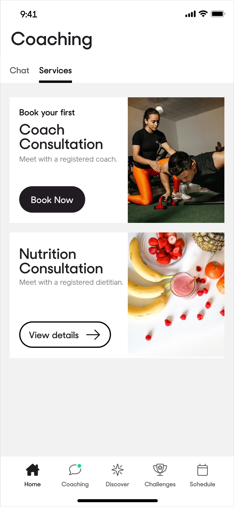
The team selected option 2, with some modifications, because of its simplicity for the MVP and flexibility for members that do not have access to a nutritionist.
DESIGN
COLLECTING USER DATA: MINIMAL V. SUPPLEMENTARY
After creating an easy pathway into the booking flow, I explored what user data would be valuable to collect. The challenge was balancing the user-centric bias for a minimal flow with the aim of coaches and nutritionists who would benefit from more user data to better prepare for sessions.
Goals
During discovery I learned that coaches and nutritionists often ask members what their goals are at the beginning of a session. To save valuable session time I included a question in the booking flow about a member’s goal. Members select a specific goal during app onboarding; I used this same screen and asked members to now confirm they have this same goal at the time of their session booking.

Reason for booking
There was a lot of team discussion around if we should ask users why they were booking a session, and how we could do so. During discovery coaches and nutritionists shared that most members have the same key reasons for booking a session. In initial designs I included a list of predetermined options.

During a design review many coaches and nutritionists shared that they would appreciate a space for members to leave open-ended responses. Another design option then included both open-ended questions and a space for additional comments. However, after further review the predetermined responses were removed to reduce the noise on this screen and prevent member decision paralysis.


There was later concern that omitting predetermined options would slow down members and increase the probability of member drop-off. Finally, we included two screens: one screen with predetermined responses and an additional screen for members to include any additional details around their booking, however this screen was denoted as ‘optional’ so a member could quickly skip this step if desired.

DESIGN
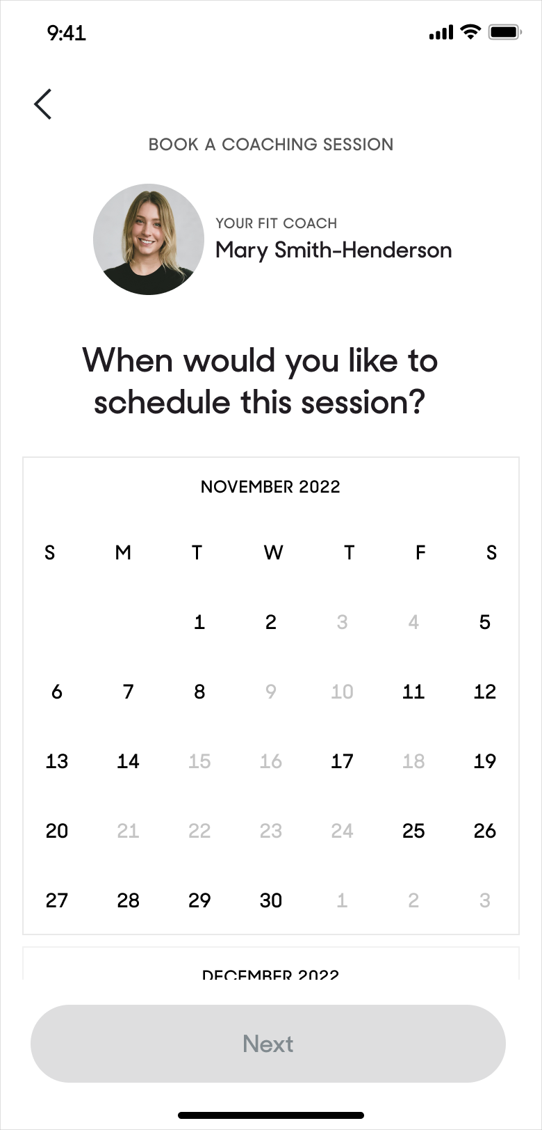
SELECTING THE DATE AND TIME
Finally, I focused on the core of the booking experience: the selection of the appropriate date and time. Factors that informed my design UI included limiting engineering effort, simplicity, and flexibility around the availability of coaches and nutritionists.
Option 1: Existing date picker
The initial approach centered on an existing date picker component used elsewhere in the app to reduce development time and effort.

Option 2: Expandable list
This next approach was inspired from other related product experiences, such as the One Medical appointment booking flow. Members could choose from a clear list of appropriate dates and times or quickly see when their desired coach or nutritionist had their next available session. One downside of this option was that members weren’t prevented from selecting a day with no available sessions.

Option 3: Calendar
I explored a calendar component as an alternative that displayed greyed out days when a coach or nutritionist had no availability. I confirmed with the dev team that this would not require too much effort and our team moved forward with this option. Displaying available times in the next screen would now be simpler as the member could be assured there is availability on the day they selected.

DESIGN
TESTING & ITERATIONS
Because the engineering schedule for another project ran over, I was able to advocate for one week of rapid usability testing. Within this time I:1) worked with our data scientist to shortlist appropriate members based on various segmentation, 2) recruited testers, 3) created a prototype and testing plan, 4) conducted and moderated virtual tests and 5) synthesized findings. I moderated 30-minute testing sessions with five members. Testers found the flows clear and had minimal feedback that led to slight design iterations.
Finding 1: Information about the coaching sessions was helpful, but could be easier to read.
Members shared that the copy displayed about the coaching sessions provided valuable context, but also felt there was a lot of information to digest.

Iteration: To make the text easier to scan or read, I worked with the copy writer to add a sub-header, bulleted text and bolded keywords.

Finding 2: Members didn’t understand that their goal from onboarding was being displayed.
Members misunderstood why a goal option was selected in the prototype; they believed the option was the desired response instead of an answer previously chosen during onboarding.

Iteration: This screen was removed from the MVP redesign to avoid confusion and streamline the flow.
Finding 3: Members wanted to see the session duration when selecting a time for their booking.
When selecting an available session time, a couple of members mentioned that they weren’t aware or didn’t remember how long sessions lasted and felt this information would be valuable in selecting a booking time.

Iteration: The beginning and end time was added for each session option so members were clear how long sessions lasted.

DESIGN
END-TO-END: DESIGNING FOR COACHES AND NUTRITIONISTS
Coach Hub is Exos’s internal database for coaches to access member. Nutritionist were given minimal access to Coach Hub for this project to enter their session availability but unfortunately, still didn’t have the ability to view member data. We created a calendar in Coach Hub that allowed coaches and nutritionists to add in their general session availability. Although we relied on the vendor’s out-of-the-box UI, I worked with engineers to ensure the process was easy to understand.
Entry point
An initial challenge centered on the entry point from the initial homepage to the availability calendar. In one approach I placed a calendar icon on the main toolbar that linked to the calendar but finally decided on a simpler option: adding an item to the existing Profile drop-down menu.

Prompting a booking
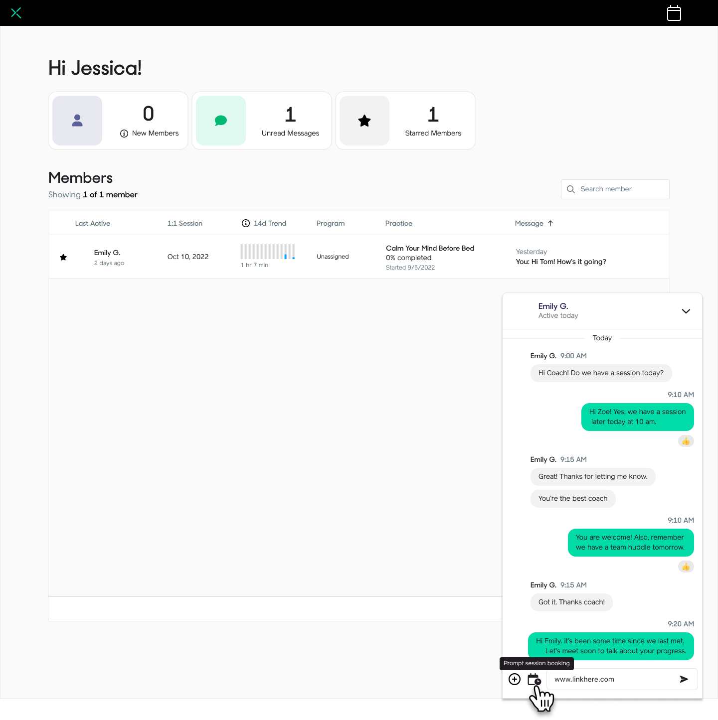

Another important feature was designing an intuitive UI for coaches to prompt members to book a session through Coach Hub. Again, nutritionists unfortunately did not have full access to the database and couldn’t chat with members. Using an existing UI pattern related to another Exos product, I added a simple calendar icon to the chat panel that would send members the appropriate booking.