Western Union Interactive Platform
In order to raise awareness and drive downloads for the release of its 62 country-specific apps, Western Union sought to create a blog page with animation and strong content.
PROJECT SNAPSHOT
Timeline
The project took place over the span of about 3 months.
My Role
I worked with a content manager, product manager, art director and senior UX designer. I created the UX design approach, produced wireframes, drafted annotations and presented design artifacts to the client.
Results
The project resulted in a content page on Western Union’s blog, which is currently live.
DISCOVERY
A PRODUCT V. INFORMATION PAGE
Western Union sought to create to a very targeted, product-centric page around the release of its apps, as well as a broader, informative experience. Striking a balance between these targets led to exploring a range of sites for inspiration.
The first step in my discovery process was assessing the older Western Union blog page: 'Currency at a Crossroads," from which the client wanted to draw inspiration but not parrot. Another source of inspiration came from Apple's HomePod page because of the creative and engaging storytelling of product features.
I was most inspired by the interactive experience on Fitbit Charge's product page. A scrollable vertical carousel served as a unique vehicle for displaying content.
EARLY DESIGN
CONTENT IS KING
One of the key design challenges was manipulating the page’s main content: six ‘Latest Trends’ on mobile transferring. The content needed to have prominence on the page, but still be engaging and easily scannable. Different options for presenting the content on desktop/tablet and mobile were drafted.


The final wireframes followed the Fitbit Charge model. The visual design on mobile had to be altered as the copy atop the background blocked most of the image and was difficult to read.
LATER DESIGN
CRAFTING AN INTUITIVE EXPERIENCE FOR A GLOBAL AUDIENCE
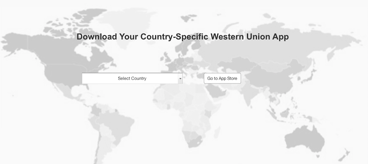
One of the requests for the page was a world map showcasing the different countries with a Western Union app. The challenge was determining how to offer an interactive experience that was mindful of screen real-estate and the resources available for the build of the page.
I designed an experience that began with the map animating onto the page. The map then became background for a drop-down menu, where users could select the appropriate Western Union app to download.
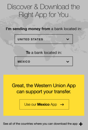
In response to client feedback, the section was altered, enabling users to input information to determine if a WU app was available and if so, which to download.
Because the nature of money transfers can be complicated and the audience for the page was so diverse, I used an input format that was simple and utilized a sentence structure.
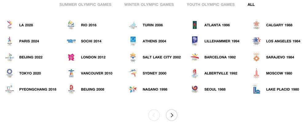
The map section required a drop-down menu to offer users the option of browsing and selecting the appropriate country app. Design inspiration came from the Olympics page; I replaced the game icons in the CTAs with country flags.
DELIVERY
CREATING & COMMUNICATING DESIGN
Because the build of the page was being handled by the client, it was particularly important to have detailed annotations for the final design files. I annotated the visual design assets, which were produced by the visual designer.


